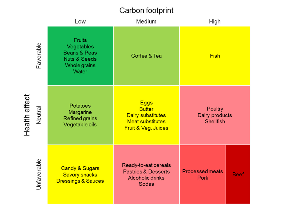
REDLANDS, Calif. — Loma Linda University researchers have developed a chart that displays 30 food groups based on both health and environmental impact.
Why it matters: This first of its kind visualization shows the effects food has on health and the environment in one clear, simple image that can be easily understood. The intention is to help consumers, health professionals, policy makers and food companies promote better decision-making when it comes to food.
Details: The chart includes three colors: green for beneficial foods, red for food that can harm health and the environment and yellow for foods in the middle. The display begins with positive foods for both health and environment in the top left of the nine-quadrant chart.
Whole plant foods, such as fruits, nuts, seeds, legumes and whole grains were found to be the most beneficial for both humans and the environment. The foods found to be most detrimental are red meat and processed meat, especially beef.
Health impacts were gauged based on cardiovascular disease, diabetes and cancer while the environmental impact is measured in terms of greenhouse gas emissions.
What they’re saying: “It’s not enough to base our food choices solely on health benefits—we also need to consider their environmental consequences, which ultimately affect human health as well,” said Joan Sabaté, professor of Nutrition and Epidemiology at Loma Linda University School of Public Health and the study’s senior investigator. “The visual we developed presents both dimensions in a simple and intuitive way, helping individuals make more informed decisions for the well-being of both people and the planet.”
Moving forward: Study researchers noted that while this chart can be a great tool, there are of course limitations. More nuanced information isn’t fully displayed. A good example is that some nuts require a large amount of water but otherwise have low greenhouse gas emissions. Despite this, the chart can still be a useful resource.
“The intuitive visualization should help people seeking to make win-win choices by clearly showing which foods have relatively low environmental impacts combined with health promoting benefits,” said Andrew Berardy, the study’s lead author. “It’s a simple representation of a complex topic, but it effectively represents impacts and tradeoffs people often don’t consider when choosing between foods.”
Kathryne is a journalist and creative writer who has contributed to CFR since 2023. When she isn't reporting, she can be found curled up with a thick fantasy book.